C-K WOMEN’S COMMITTEE BRANDING
As part of an exciting initiative, I had the oppurtunity to create the branding for my company's newly established Women's Committee. The council made its impactful debut during Women's History Month, a time dedicated to celebrating and empowering women. Our campaign focused on driving donations to women's shelters, organizing an inspiring women's panel, and fostering a supportive office environment that creates space for equality.
Cramer-Krasselt / 2024
Role: Research, Design, Creative Direction
The Challenge
The objective was to develop a vibrant and engaging brand system that celebrates women while seamlessly integrating with CK's existing branding. The goal was to create a cohesive and eye-catching visual identity that highlights the contributions of women and resonates with our core brand values.
The Approach
The objective was to develop a vibrant and engaging brand system that celebrates women while seamlessly integrating with CK's existing branding. The goal was to create a cohesive and eye-catching visual identity that highlights the contributions of women and resonates with our core brand values.
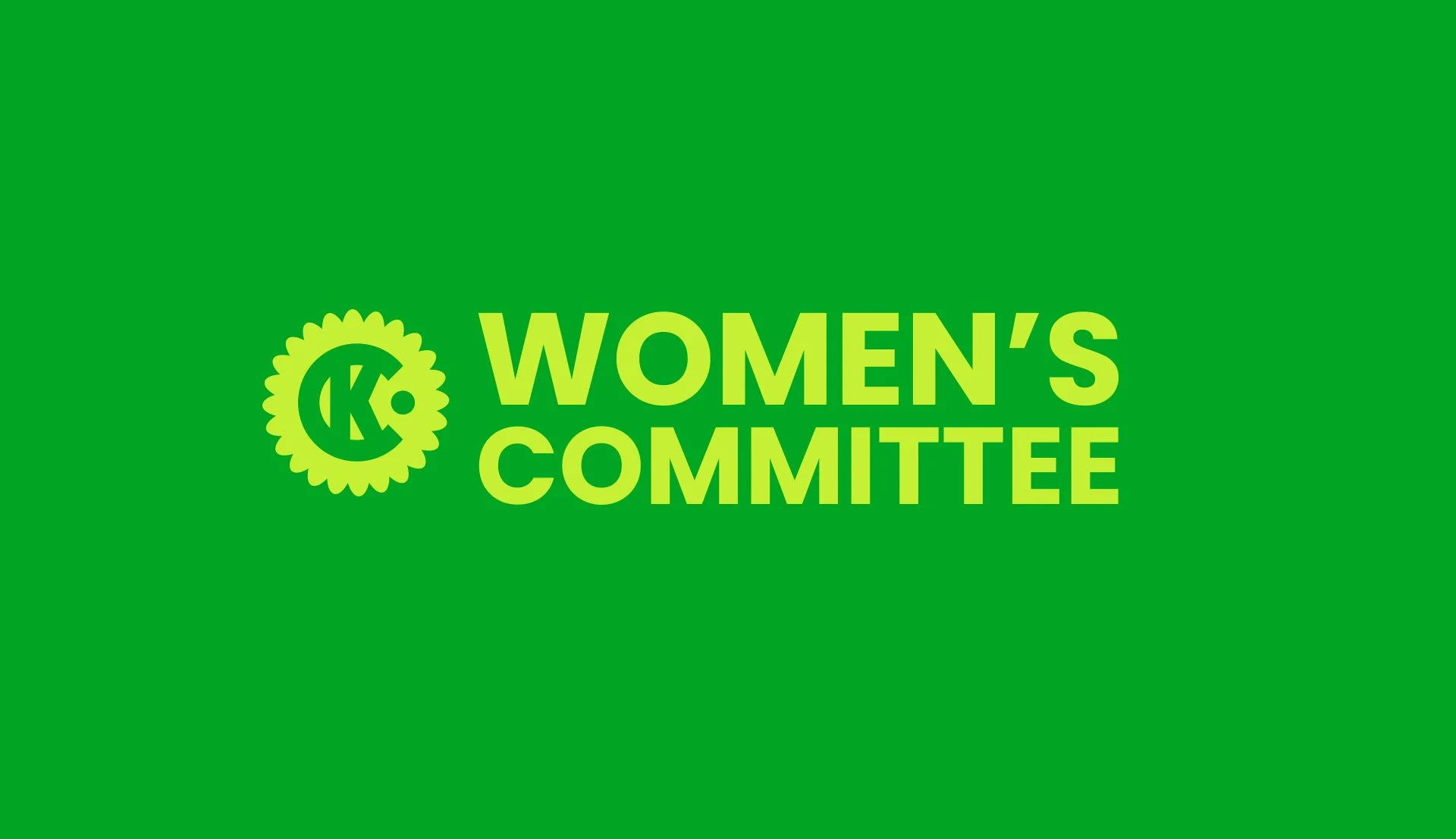
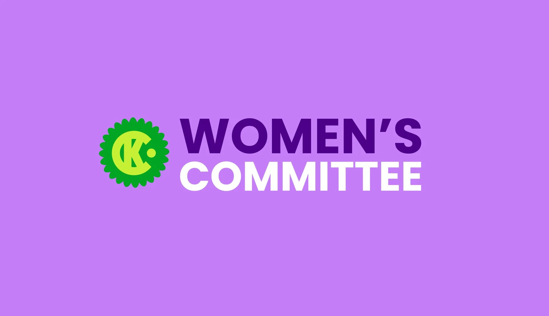
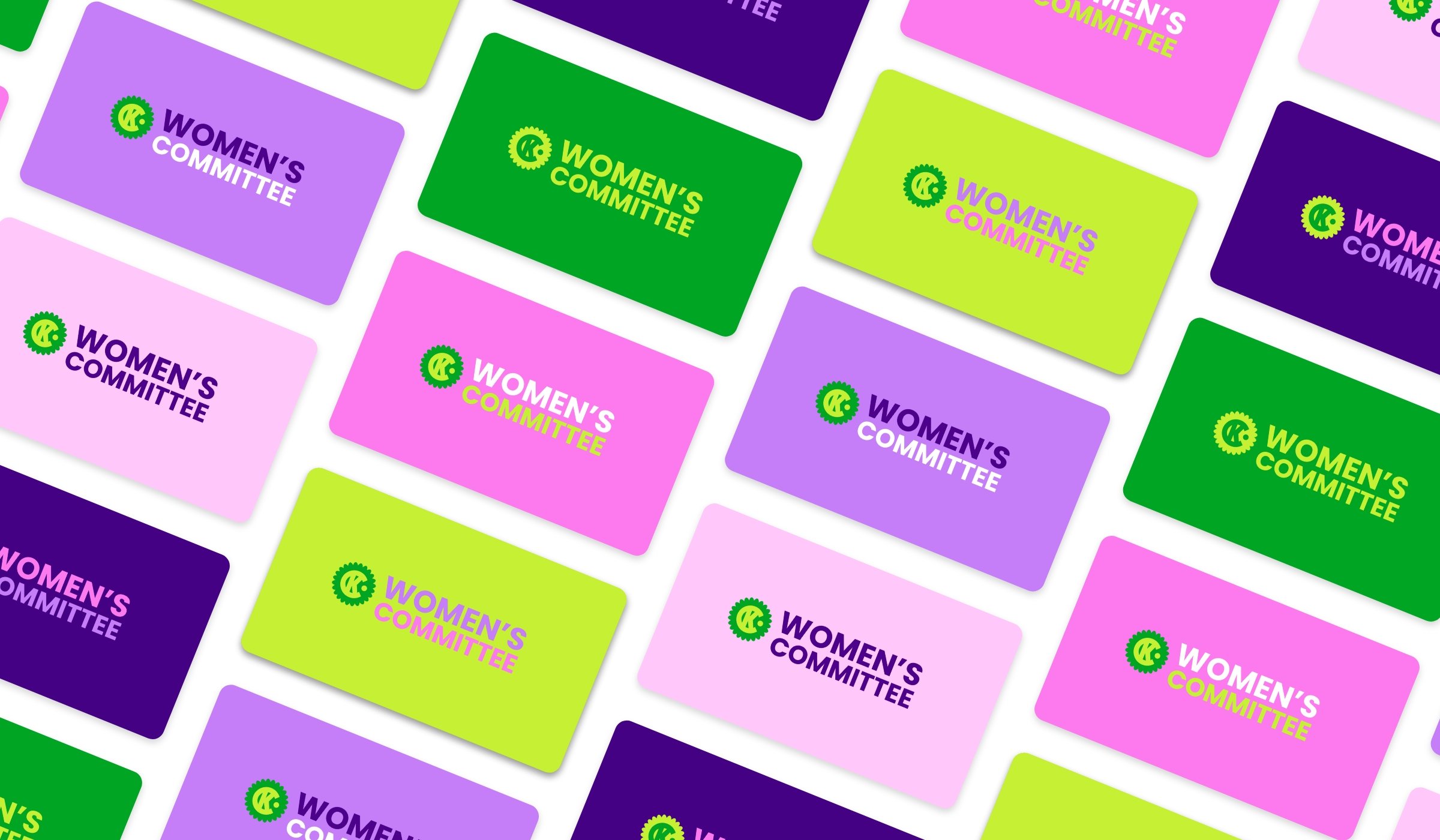
In alignment with C-K’s brand guidelines, I designed minimalist logos using the Poppins typeface. The project aimed to create eye-catching options for presentations and screensavers. To distinguish the committee’s logos from standard C-K messaging, I incorporated a scalloped shape behind the C-K logo.
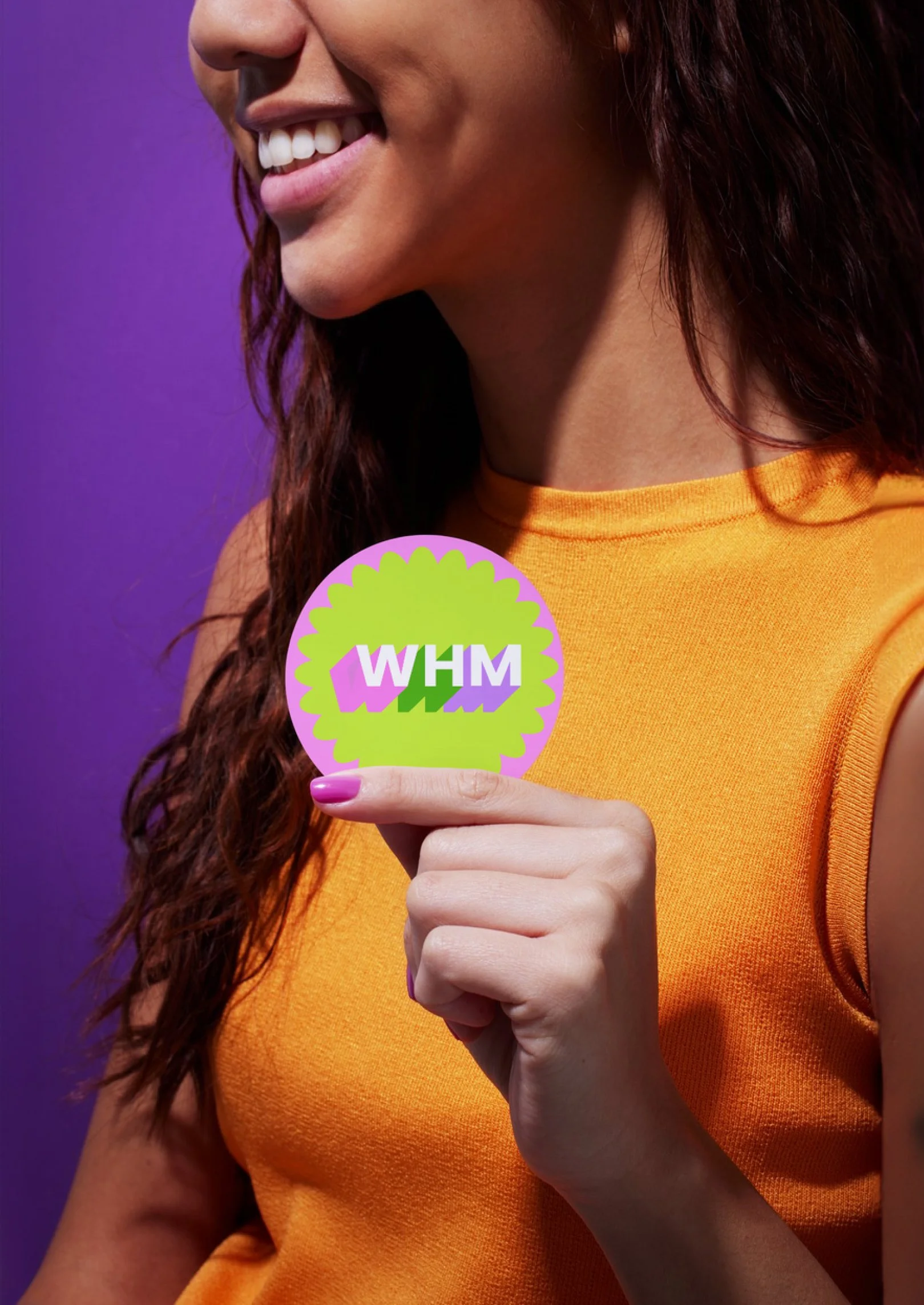
The color palette drew inspiration from the official colors of Women’s History Month—green, purple, and white—enhanced with C-K’s classic green and a lively neon variant. Pink was introduced to complement the green and to evoke the traditional association of pink with girls. The addition of neons added a retro flair to C-K’s minimalist aesthetic.


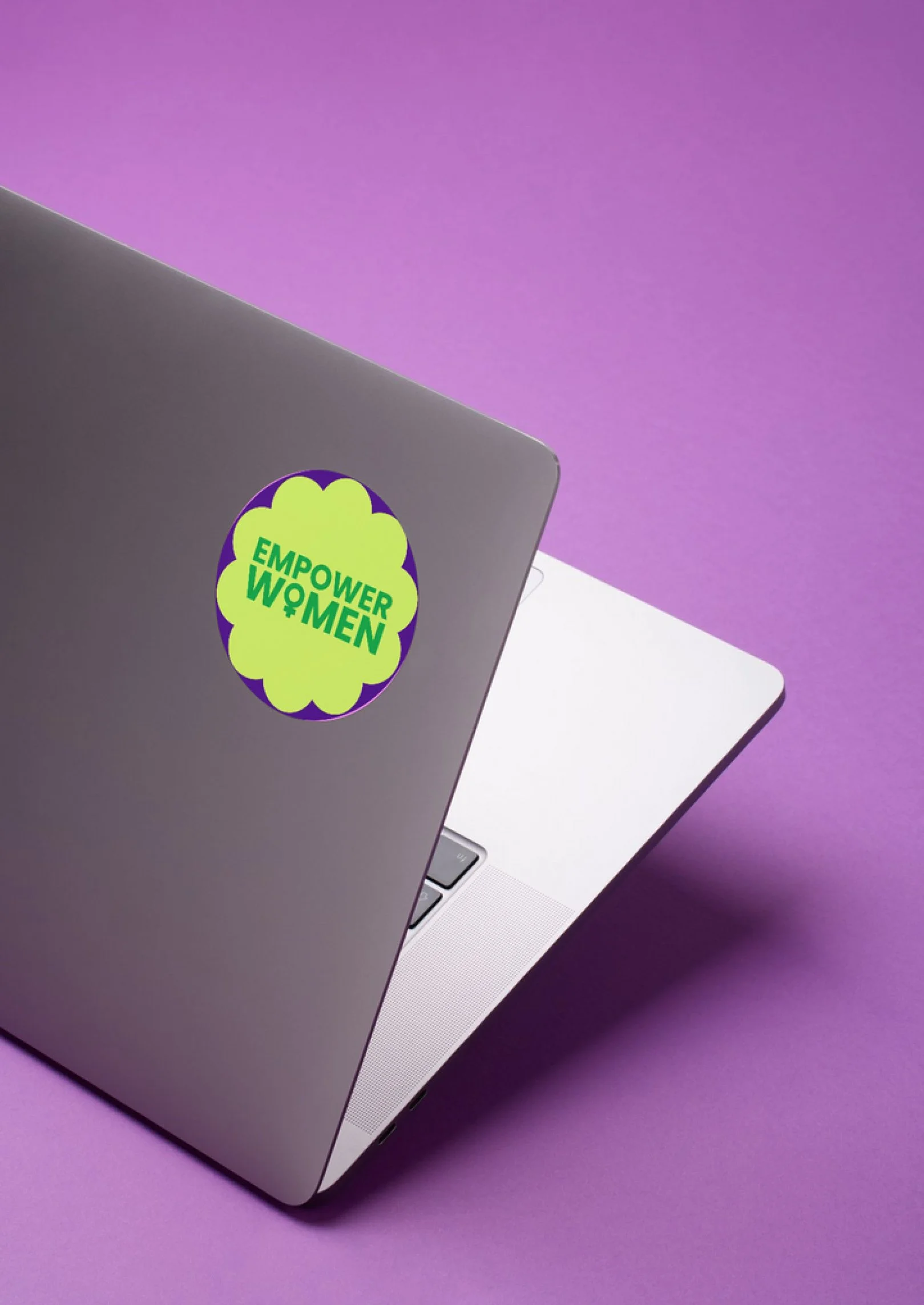
In this project, I reflected C-K’s current circle-themed branding. The circles symbolize the agency’s interconnected values and contribute a friendly aesthetic to the overall branding. I introduced scalloped designs as variations of these shapes to achieve a feminine feel, representing the group's identity. Additionally, I ensured that the shapes complemented the Poppins font, maintaining visual harmony and coherence in our design.
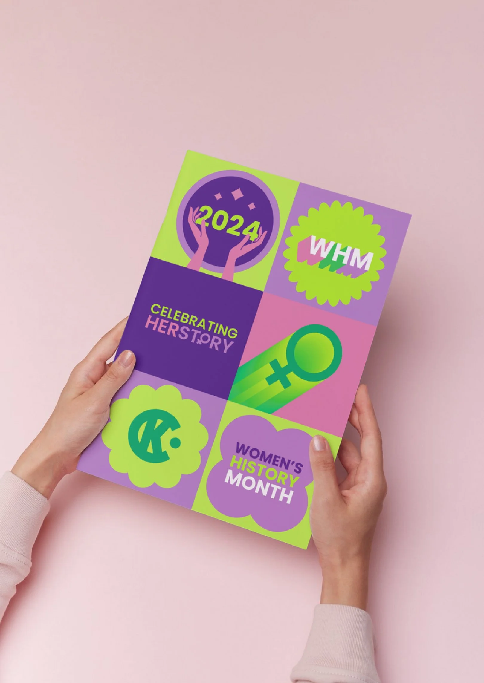
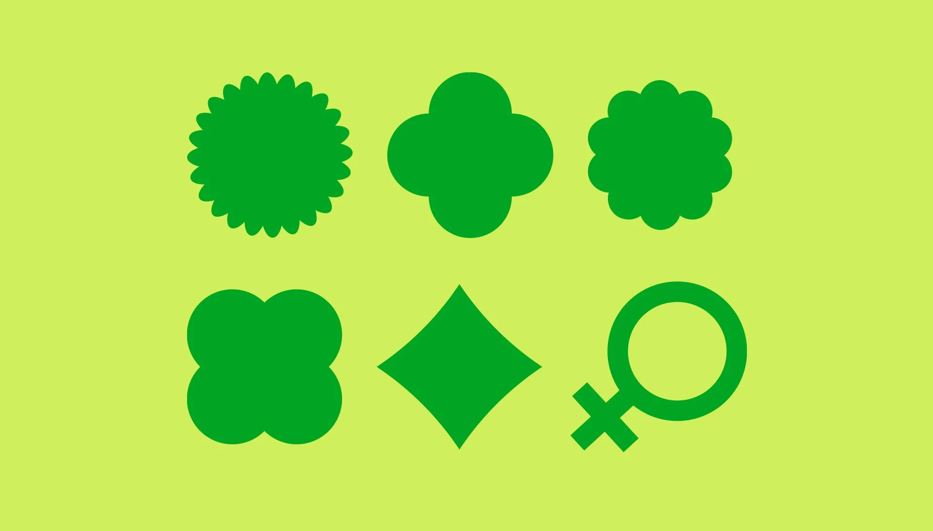


The first task for our new branding was creating Team icons for Women’s History Month. Initially, I included a variety of colors, but ultimately decided to streamline the palette to ensure each element felt essential to the design.
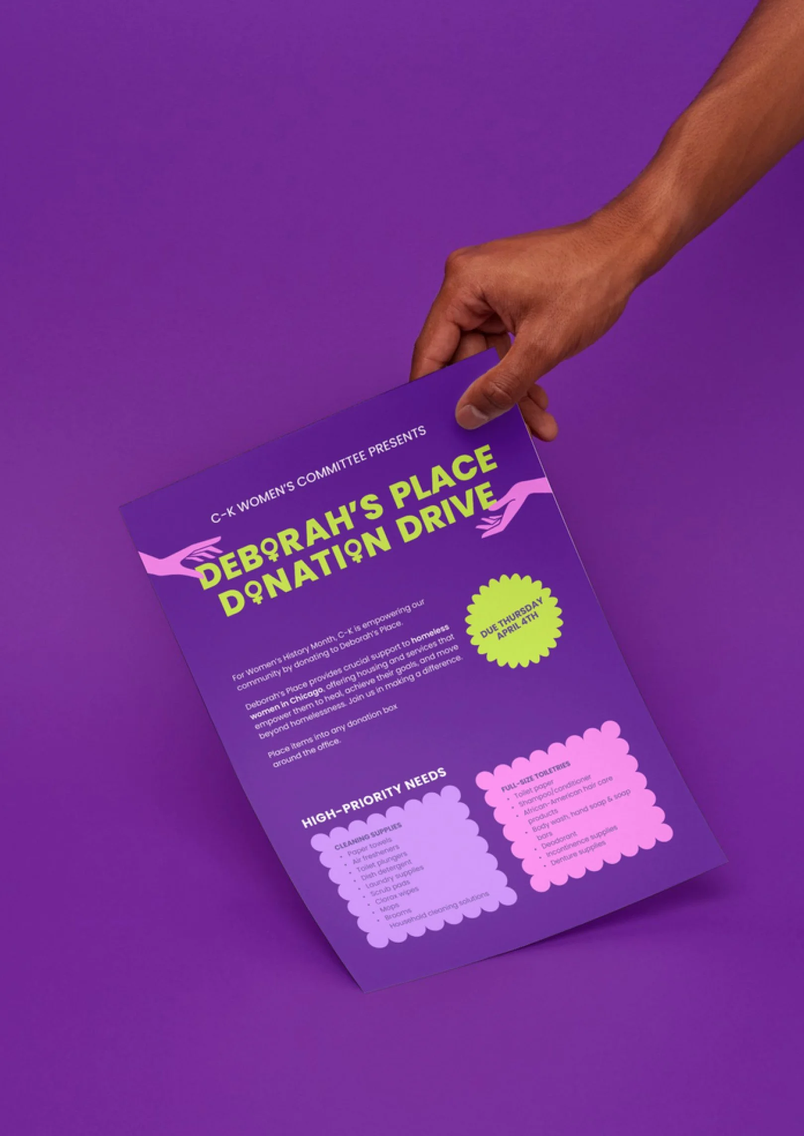
The designs were repurposed into posters displayed around the office to promote the month’s celebrations and a donation drive for a women’s shelter. The positive reception of these designs led us to explore turning them into laptop stickers.