SPIRIT AIRLINES PRE-FLIGHT EMAILS
Spirit Airlines tasked our team with creating a series of pre-flight email designs for their Guests. This project required our team to follow the product design process, starting with user research and competitive analysis. We made wireframes which developed a functional design while improving the existing content. Reinforcing the importance of user-centric design, the project tested our ability to balance creativity within constraints and prioritize the functionality of design.
Cramer-Krasselt (2023)
Role: Protyping, Wireframing, UI Design, UX Research
Team: Sangbum Kim (Design Director), Erin Knott (Sr. Designer)

The Challenge
Consumer Journey
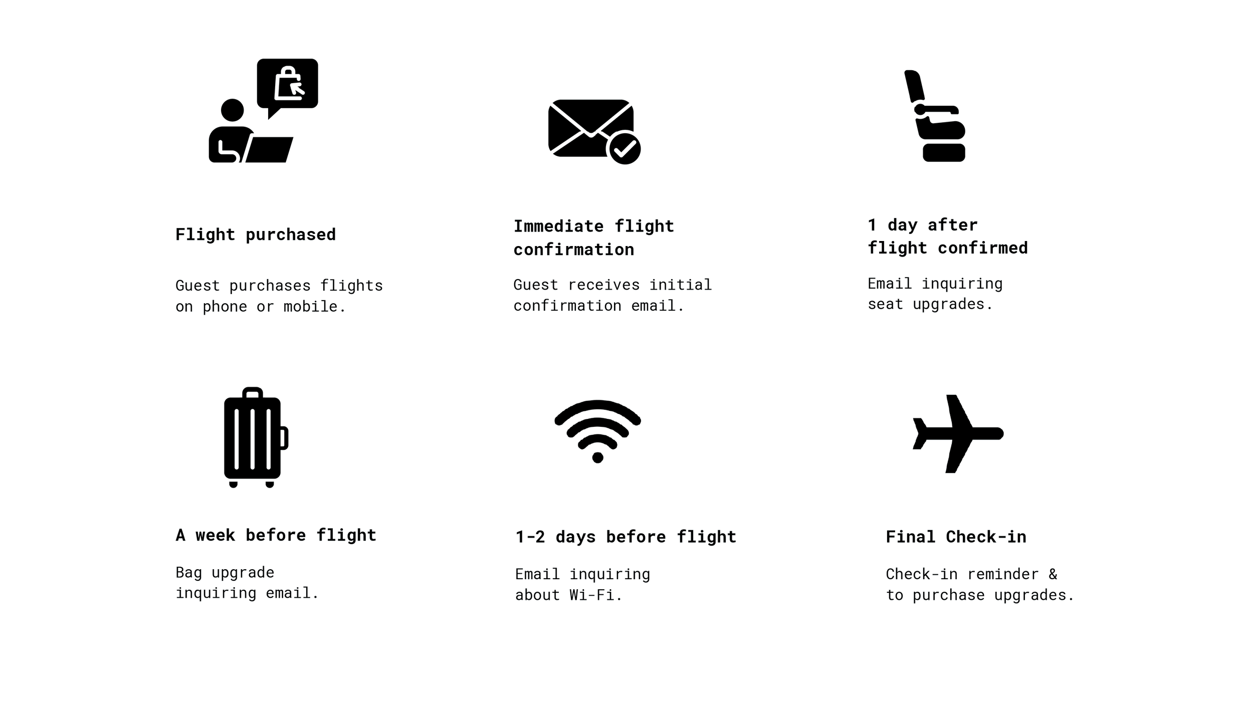
After thorough research, we identified the optimal touchpoints for reaching out to guests, resulting in a series of seven different emails. To avoid overwhelming guests who book their flights close to the departure date, we implemented a strategy to reduce the number of emails they receive.

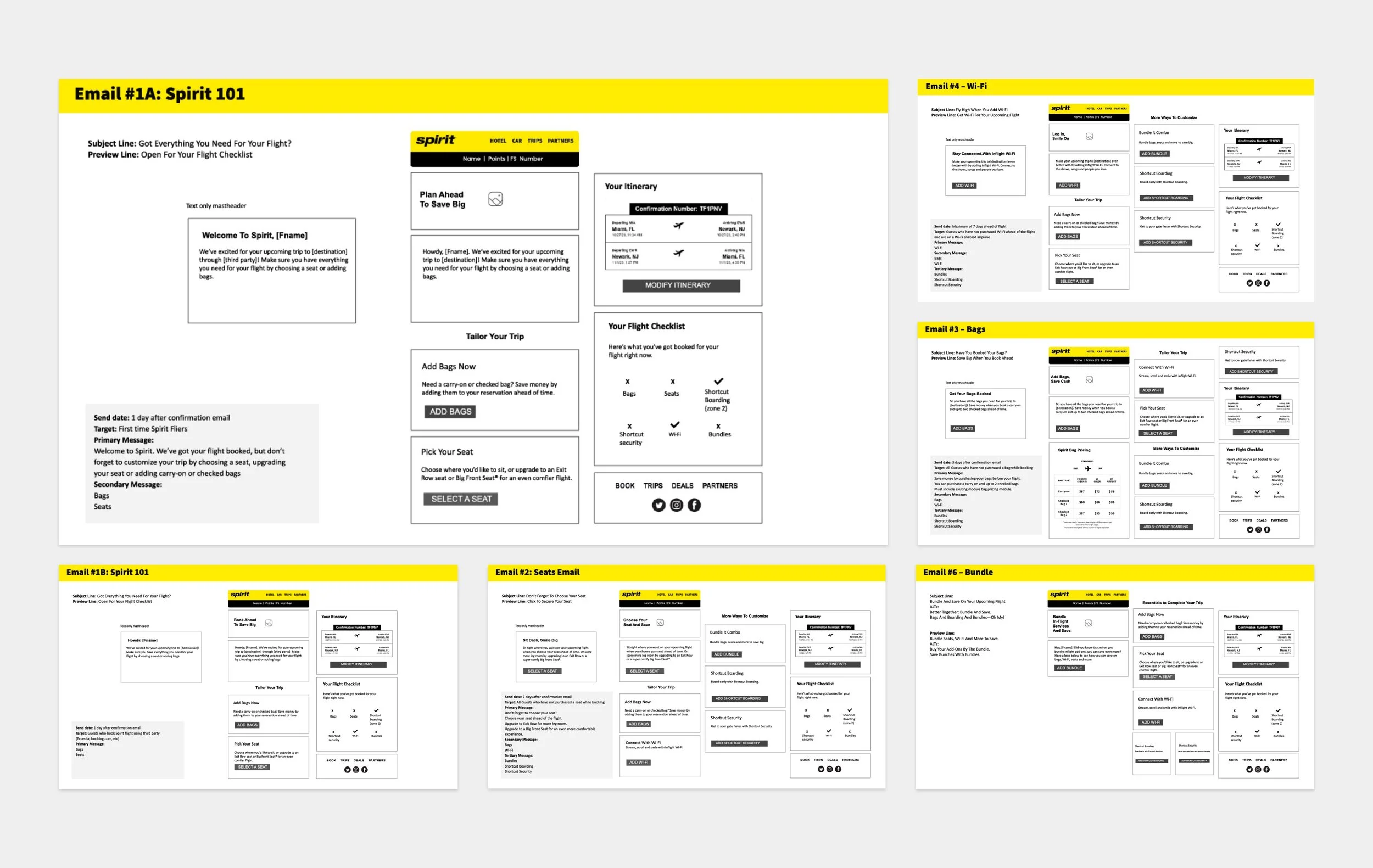
We developed wireframes complete with copy to outline the layout of each email. These were presented to clients to ensure alignment with their vision. By organizing the content according to its importance, we established a clear and effective information hierarchy.

-
Once a Guest books a flight, several emails are sent out between the time of booking and the flight date to remind Guests to purchase ancillary products including bags, seats, Wi-Fi, Shortcut boarding, shortcut security and bundling flights with car/hotels.
-
Guests with an upcoming Spirit Flight who did not purchase all ancillary products at the time of booking.
-
View flight information easily, purchase flight add-ons easily, plan flight with ease!
Wireframes
-
Existing brand guidelines, restricted launch timelines
-
Show more potential ancillary products for Guests to purchase to increase revenue on all products.
-
Create several preflight dedicated emails with an improved design system
The Solve
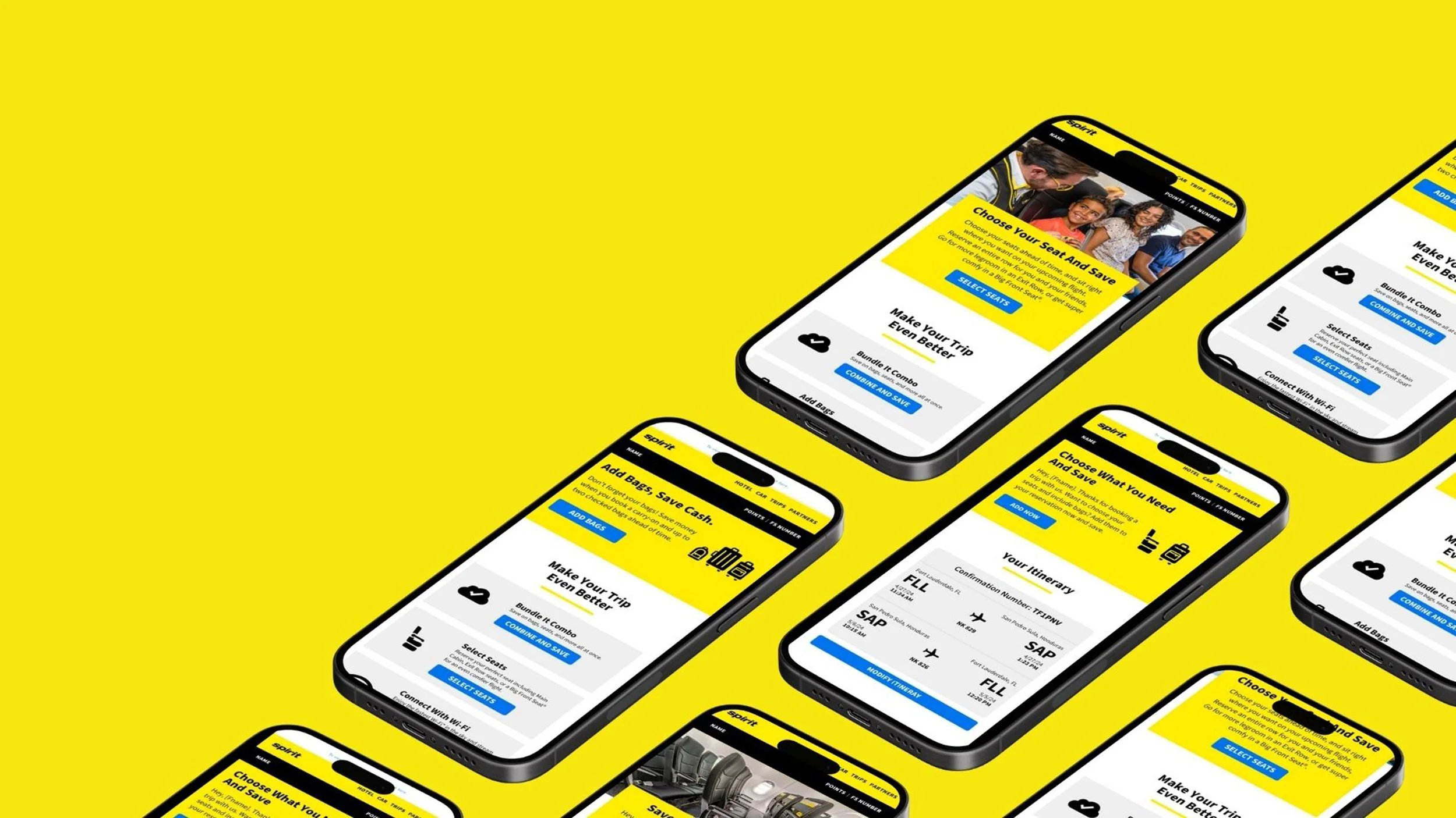
The outcome was a modular design that effectively highlighted Spirit's available upgrades. We ensured the layout was clean and easy to navigate. Testing revealed that users were more likely to click when buttons were displayed at their full size.

We developed multiple iterations of each module, incorporating key elements observed in competitors' itinerary sections. We redesigned Spirit’s old itinerary module to make the flight information easier to read. Icons were added to help users quickly understand the content of each section.


Final

